

PROJECT REVEAL
A 1950s Home, Reimagined for the Way This Family Lives
This family had a beautiful location in East Grand Rapids. The kids could walk to school. They loved where they were, and they didn't want to move.
But the house was built in the 1950s, and the inside was a series of very small rooms. That just didn't work for how their family lives today, or how most families live today. They love modern design, cook every day, and often eat together as a family. Both the husband and wife wanted to be part of every design decision, which made this one really fun.
So we took it down to the studs and reimagined every inch of the interior! The goal was modern, bright, and happy, with lots of natural light and a limited finish palette throughout.
Here's how it came together.
Down to the Studs
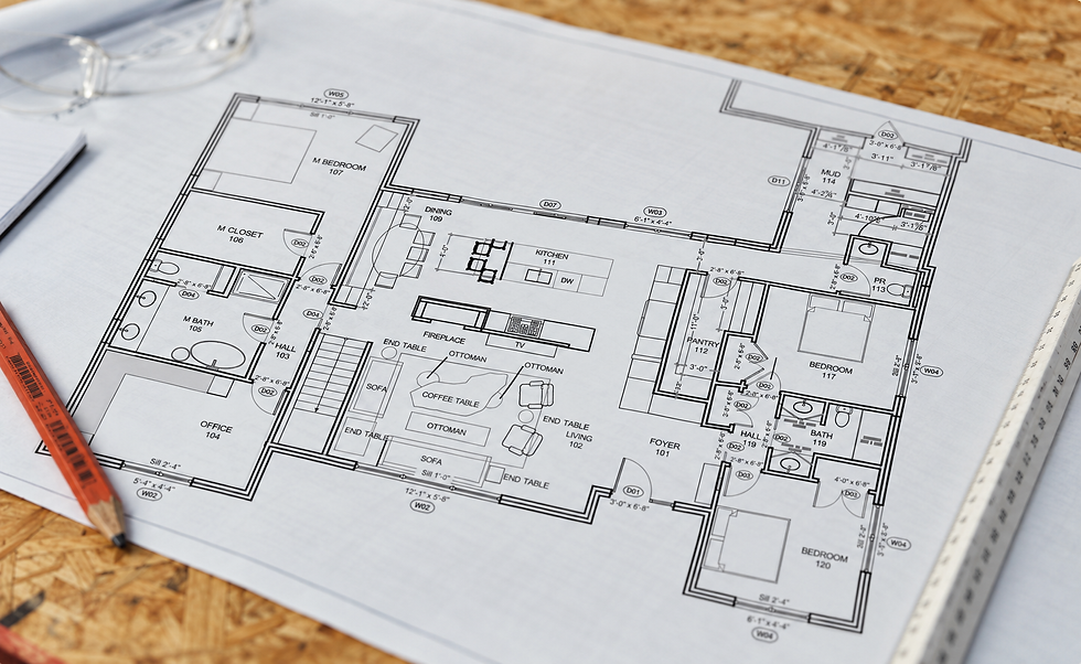
This was a full gut. We relocated the kitchen and bedrooms, gutted all the bathrooms, added a new mudroom and powder bath, relocated a two-sided fireplace, and added a walk-in pantry with tons of storage.
The house is shaped a bit like an H. We moved all the living spaces to the middle of the house, with the private areas, bedrooms, and bathrooms on either side. On one end, we created a proper primary suite with a bedroom, walk-in closet, full bath, and an office. The kids' rooms are on the opposite side of the house; it works really well for this family!
We were all in on this project: the kitchen design, a custom breakfast nook, the lighting plan, tile drawings, and all of the furniture, rugs, lighting, and artwork. I love finishing a space down to every final detail, and this one was a complete joy.
A Kitchen at the Center of the House

We moved the kitchen from one end of the house to the middle, back to back with the living room. Instead of looking out at the side yard, it now takes advantage of the windows and a slider out to the backyard.
This client cooks, and storage was a big issue. The footprint is average size, but we maximized the kitchen and pantry layout, and more than quadrupled their storage. This re-design has made every day use such a dream, easy and seamless.
The walnut cabinets are absolutely stunning. The pulls are integrated, part of the cabinet itself, and they run the full length of every door and drawer. I absolutely love this design detail!
I used the stone Quartzite Crystal Tempest for the countertops because we loved the mix of gray, cream, white, and amber tones.
The amber streaks pull in the richness of walnut wood, yum! Our island is 12’ long in this project, and stone slabs do not come in that length, so we incorporated a metal transition detail to extend our counter and include island seating.
The Wall We Kept
With the kitchen and living room back to back, we had to decide how open to go. We kept a wall up between the two, with floor-to-ceiling openings on either side.
It still feels open. When you walk in from the foyer, you can see both rooms at once. But if the kitchen gets messy, you're not staring at it. Someone can hang out in the living room without being in the middle of all the busyness.
The wall also adds kitchen storage and holds the two-sided fireplace. You can enjoy the fire from the breakfast nook and from the living room, and it gives you a little sightline between the two spaces. The rooms feel connected, and each one keeps its own character.
We kept the hood simple, with a shelf for spices and cooking utensils. There's seating at the end of a really long island, so you can have dinner for two in front of the fire, or sit and talk to the cook.
A Slat Wall at the Stair
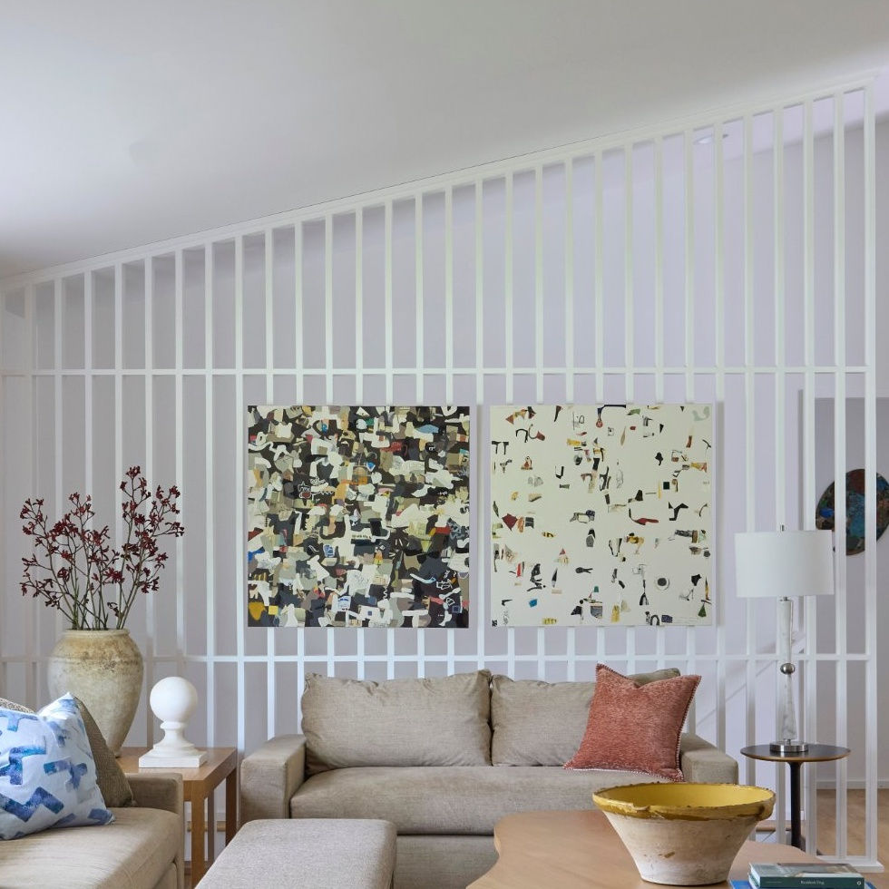
We relocated the stair to the basement to free up space for the kitchen, mudroom, and pantry. It now sits at the far end of the living room, and we designed a slat wall to go floor to ceiling. You still get the volume of the staircase in the room, with a little separation and some architectural interest. We hung art right on the slat wall, collage pieces by local Michigan artist John McLaughlin. I love the dimensionality of it.
A Living Room You Can Change
We kept the living room soft and neutral. A more traditional rug, soft tan sofas with the length customized to fit the space perfectly, and soft tan draperies to coordinate. The sofa fabric is commercial grade, extremely soft and very durable.
This is a large room, and one thing we always solve for in larger rooms is side tables that are big enough to connect the furniture. We designed two custom side tables so everyone sitting has somewhere to set things down.
The Eames chairs were a gift from his parents, and they're originals. That was really fun. We also brought in a bowl from our antiques shop and a plaster architectural piece I had made in France. The color is minimal, and that's on purpose. The room has a very calming effect, and it's easy to change out the pillows or artwork and make it feel completely different.
The Breakfast Nook

This is one of my favorite spots to design. At one end of the kitchen, we wanted a place the family could sit down for dinner, with a bench long enough to fit a few more friends.
On either end of the bench are storage towers for craft supplies and extra kitchen items. The kids can grab a pencil without getting up from the table.
I love the banquette fabric. It's a commercial-grade Maharam with a large-scale pattern, a mix of warm and cool tones, white and cream. Since the pattern repeat is so large, almost every back cushion shows a different part of the pattern, and you can read it from across the room.
We mixed in mint green chairs that wipe down easily and add a little soft color, with an oval walnut tulip table. I love oval dining tables. The soft edges make it easy to get around, especially at a banquette, and easy to keep adding chairs.
The Primary Suite

We moved the primary bedroom to the back of the house and installed a large picture window, with floor-to-ceiling draperies that blend softly into the wall. Simple wall sconces on either side of the bed are the main lighting.
The nightstands are mid-century modern French walnut, from a trip to France. I brought them back, and they worked perfectly in this room.

The primary bath has a floating walnut cabinet, and we kept it light and bright. A random tile pattern with a little texture runs above the sinks and in the shower, with large-format tile on the floor for a seamless look. There's a lot of hidden storage in here too, including medicine cabinets.
A Bath the Girls Won't Outgrow

I wanted the kids' bath to feel fun, but timeless, so it wouldn't feel too young in a few years. We used one geometric tile on the floor and the shower walls. I love that seamless look, and the pattern feels a bit mid-century, which is when the house was built.
I'm a huge fan of color, but here it was fun to keep the tile neutral and play with soft lines and pattern instead. The vanities face each other, with a pocket door and mirror on all three sides of the vanity. This makes the room feel larger and gives the girls as much space as possible to get ready. White oak cabinetry and simple round knobs are a little nod to the age of the home.
The Hardworking Powder Bath

Near the mudroom, the powder bath works hard. A simple oak floating cabinet, a wall-mount faucet, no backsplash, and an easy countertop. Blue was their favorite color, so this was the perfect place for it. We color-blocked the walls with paint, black on the back wall paired with two different blues.
A Home for the Long Haul
We focused on the main level, where this family really lives. There's a lower level with a lot more square footage, but the goal was the everyday: making their day-to-day easier and more joyful because they can really use the whole space.
We designed this to be their long-term home, at least while the kids are still home. The kids can still walk to school, and now the house finally works for them too.


Comments